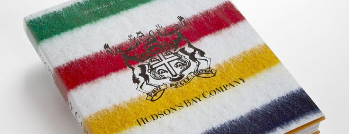
During a transitional period, I took over as Creative Director for all the brands of HBC, including Hudson's Bay. We modernized the brand around under-utilized strengths—Canadian identity and the iconic Hudson's Bay stripes—building a strong creative foundation for future growth.
IMPACT
• We unified the brand's identity across a wide array of media.
• Online, we drove record-breaking traffic to TheBay.com, including the site's biggest day ever.
• We unified the brand's identity across a wide array of media.
• Online, we drove record-breaking traffic to TheBay.com, including the site's biggest day ever.
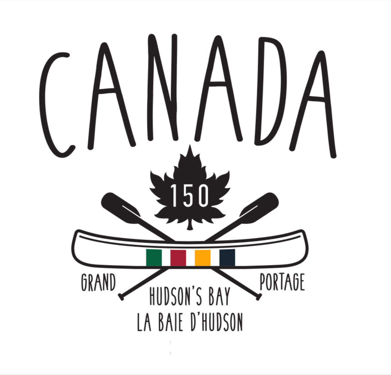
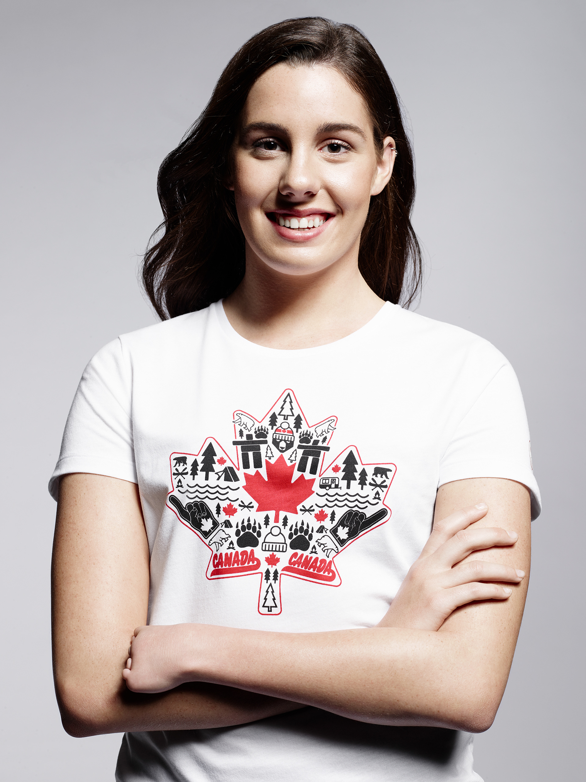
To celebrate Canada's 150th birthday, Hudson's Bay launched an initiative to connect the Trans-Canada Trail, a 15,000-mile system of hiking trails that stretches from the Atlantic to the Pacific to the Arctic oceans. We raised funds and created a campaign shot along the trail—now the longest recreational, multi-use trail network in the world.

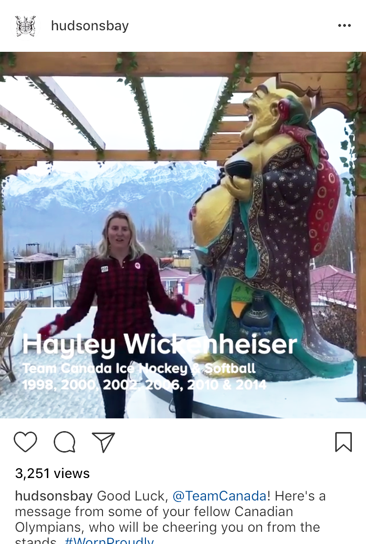
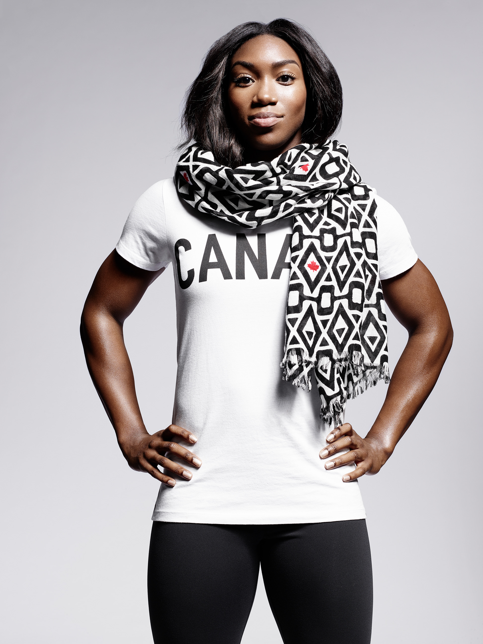
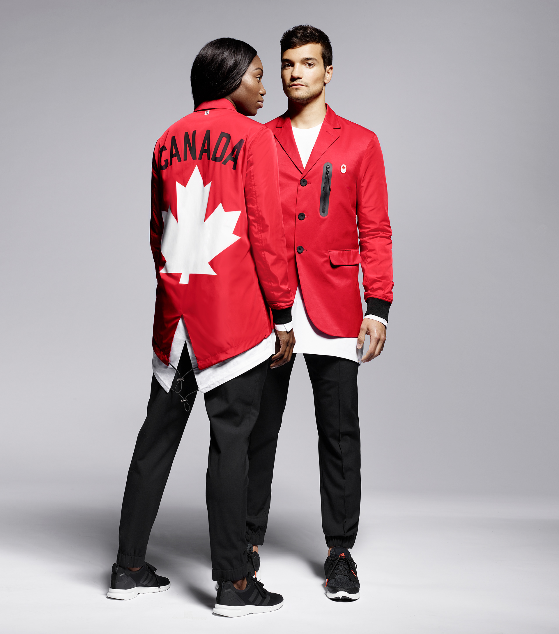
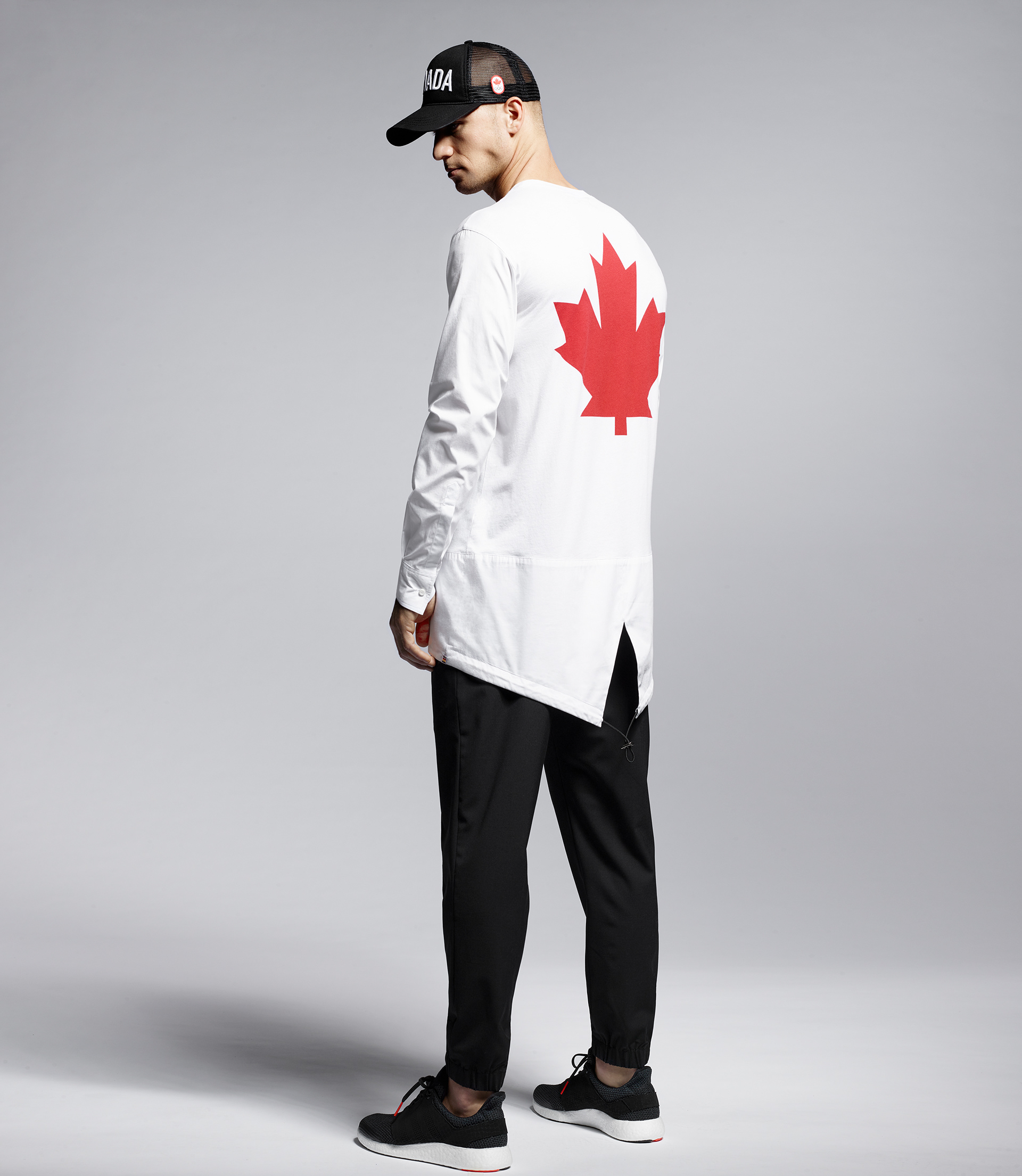
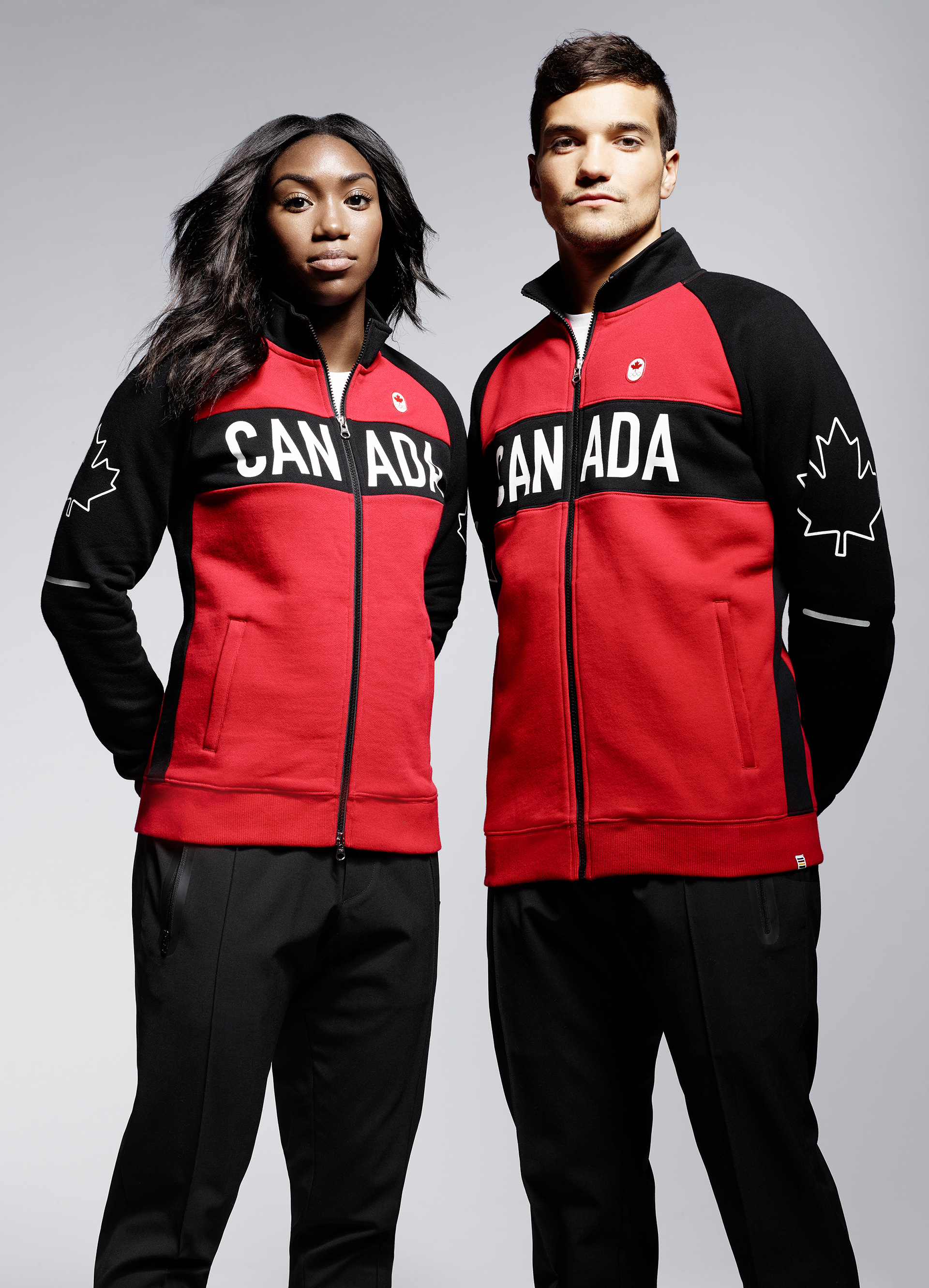
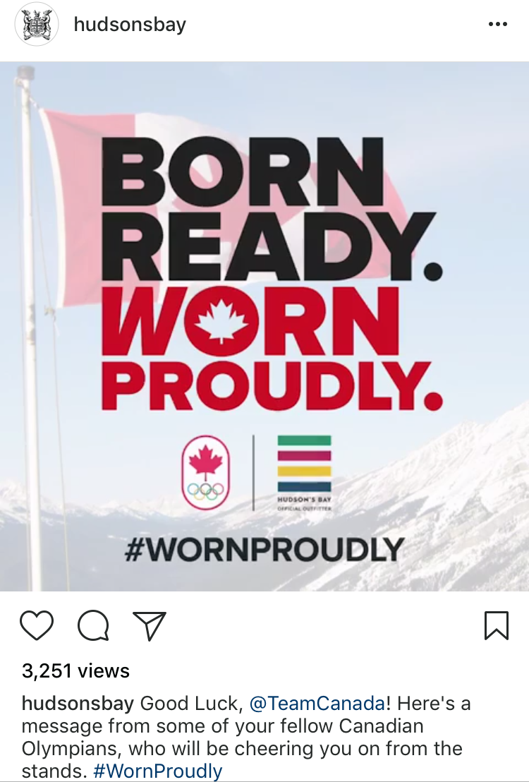
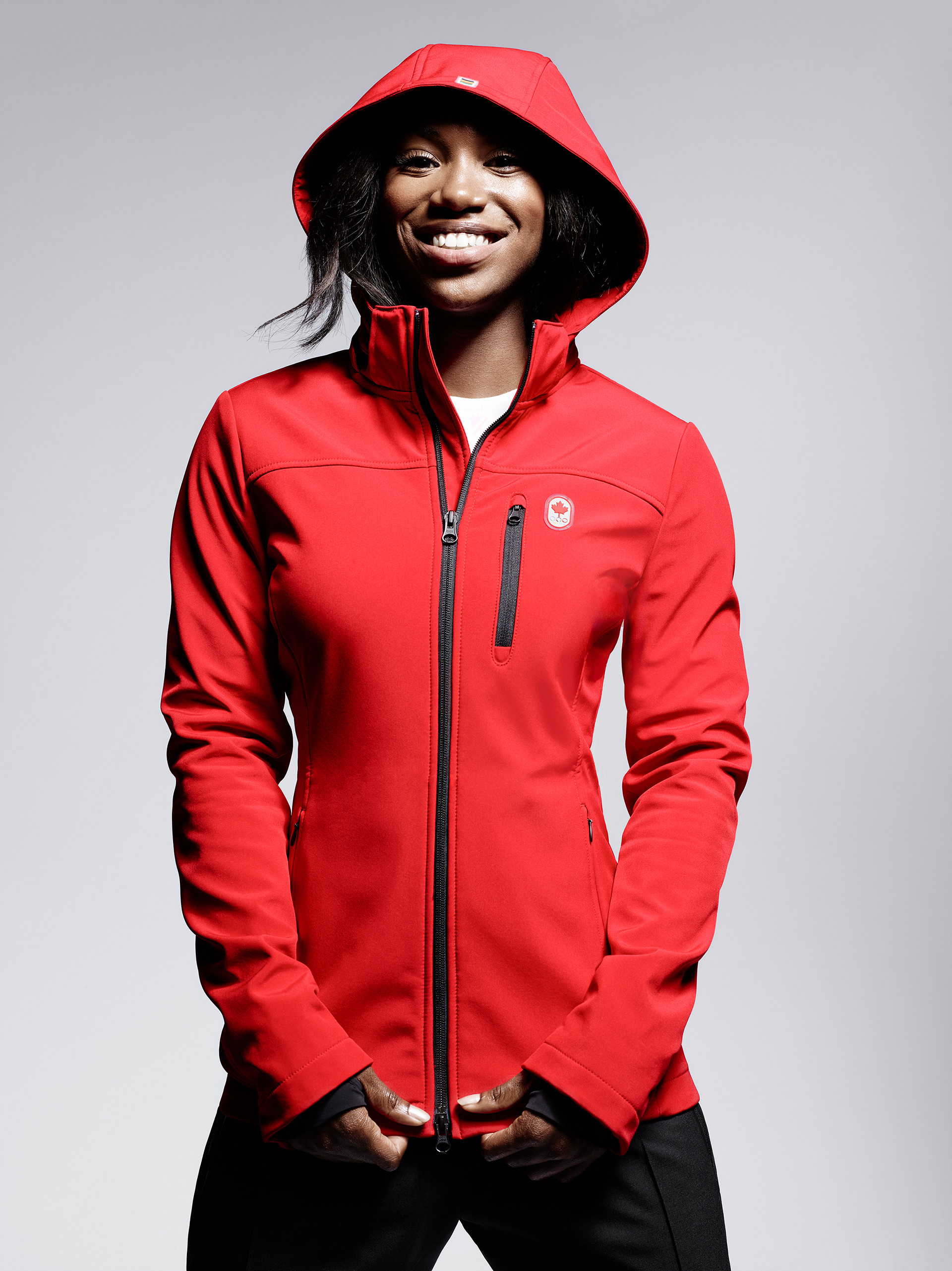
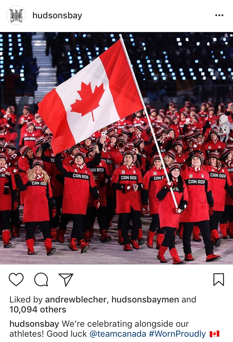
Hudson's Bay had long been Team Canada's outfitter for the Olympic Games. We turned the partnership into an athlete-led celebration of Canadian culture and identity. In the lead-up to the 2018 Pyeongchang Olympic Winter Games, we built a robust narrative through a string of personal videos, uniform unveilings and BTS stories.


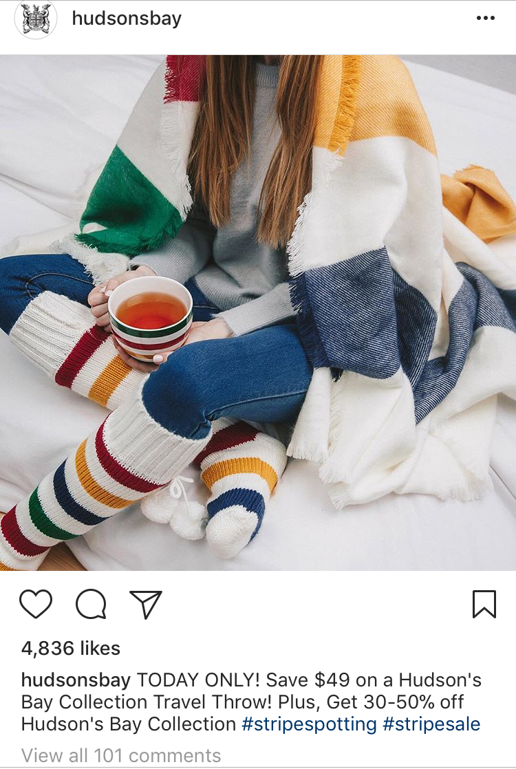
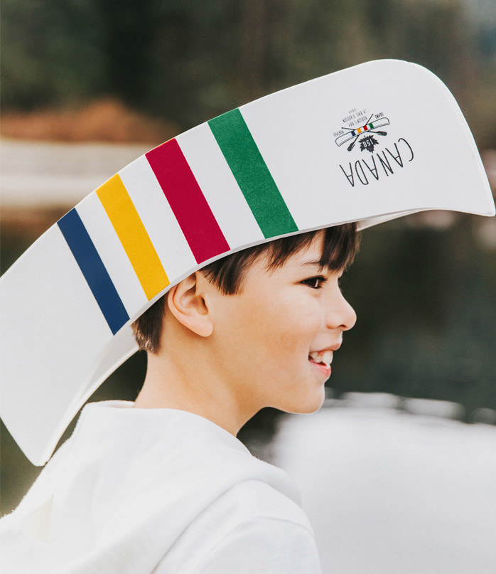
Hudson's Bay's stripes are as recognizable as the Canadian flag, but they were being under-utilized as a defining symbol of the brand—especially online. We brought the stripes into the website UX design, tastefully incorporating the colors throughout. We also brought the stripes into our social media feeds via user-generated content, influencers and more, highlighting the meaningful role that Hudson's Bay played in Canadians' lives.